¶ Design
The Design section of the Discovery Layer Manager manages the look and feel of the Discovery Layer. It allows you to change the design and layout of the Header, Home Page, and Footer. For each of these elements, users can create multiple designs and select one to appear as the default (current display).
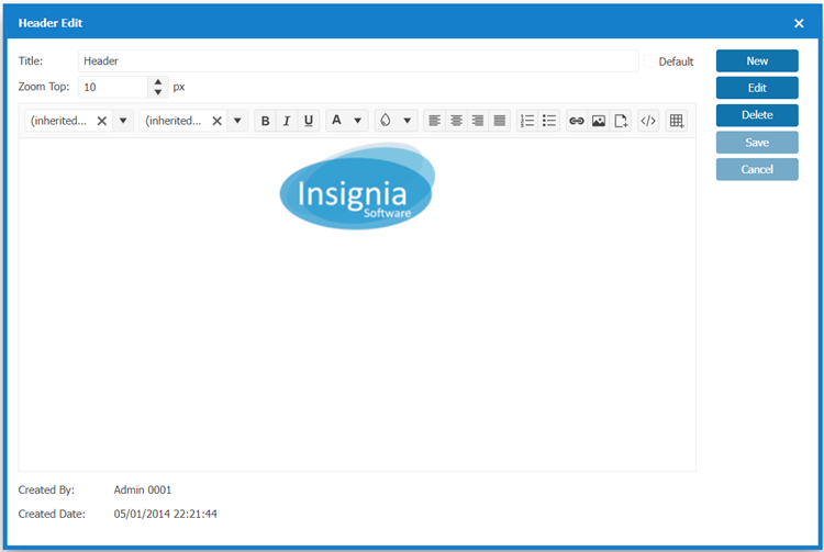
¶ Header
The Header is the portion of the webpage that appears at the top of the page above the Menu Icons.
¶ New
- Navigate to Design > Header.
- Select New.
- Enter a Title for the Header.
- Create your Custom Header using the Design Window.
4.1. Tools / Options:
| Option | Description |
|---|---|
 |
Change the Font Style to Bold, Italic or Underlined. |
 |
Change the background color. |
 |
Change alignment (left, center, right, or justify). |
 |
Create an ordered list (numbered) or unordered list (bulleted). |
 |
Insert a hyperlink to link text to a web page or document. |
 |
View and edit the HTML source code of the content. |
 |
Insert Image from your device or a URL. Options include: - Upload: Browse and upload an image from your device. - Web Address (URL): Enter the direct link to an image hosted online. - Alternate Text: Provide a description of the image for accessibility and SEO purposes. - Width (px) & Height (px): Set the horizontal & vertical size of the image in pixels. |
 |
Insert a file for users to view. |
 |
Create a table to organize data in rows and columns. |
5. If you want your Header to appear as the current header on the Discovery Layer, select the Default checkbox.
6. Select Save.
¶ Edit
- Navigate to Design > Header.
- Select the Header Name.
- Select Detail.
- Select Edit.
- Edit your Custom Header using the Design Window.
- If you want your Header to appear as the current header on the Discovery Layer, select the Default checkbox.
- Select Save when finished.
¶ Home Page
The Home Page is the main part of your library’s Discovery Layer. The Discovery Layer includes a variety of widgets arranged in columns. Insignia supports a variety of widgets including pre-defined options that pull data from the ILS, carousels that display items that meet specific criteria, and custom widgets.
¶ New
- Navigate to Design > Home Page.
- Select New.
- Enter a Title for the Home Page.
- Select Add.
- From the pop-up window Add Widget:
| Option | Description |
|---|---|
| Widgets | Select the Widgets for the drop-down menu. |
| Customize Name | Enter a Customize Name for this Widget |
| Width | Select from Width dropdown the proportional Width (1 unit, 2 units, 3 units) of the Widget you would like to appear on the Home Page. |
| Customize Height(pixels) | Select from Customize Height(pixels) dropdown the height of the Widget you would like to appear on the Home Page. |
| Rows | Select from Rows dropdown how many rows (1 Row, 2 Rows, 3 Rows) of the Widget you would like to appear on the Home Page. Note: This functionality is specifically related to carousels in the Discovery Layer. |
| Auto Scroll | Select Auto Scroll if you would like it to auto scroll. Note: For accessibility compliance, Insignia does not recommend enabling auto-scroll since it makes the content within a widget to scroll automatically. |
| Add to Start or Add to End | Select Add to Start or Add to End to place the Widget on the Home Page. |
| Child | This feature allows you to link multiple widgets together so that they share certain attributes. The Child feature allows Widgets to be tied together when moving the Widget placement on the Home Page. Any changes to the Width will apply to all Widgets in the Child group. Note: Parent/child widgets allow grouping, where child widgets inherit attributes (e.g., width) from the parent. |
6. Repeat steps 2- 6 to add the Widgets you would like to appear on the Home Page.
7. If you want your Home Page to appear as the current Home Page on the Discovery Layer, select the Default checkbox.
8. Select Save when finished.
TIP: It’s best to avoid setting a layout as the default until its design and functionality have been fully reviewed and finalized.
¶ Edit
- Navigate to Design > Home Page.
- Double-click the Home Page Title or select Detail to edit
- Use the Move Icon button beside the widget name to move Widgets within the Home Page layout. The option includes a drag-and-drop interface for rearranging widgets. Users can click, hold, and move widgets to reorganize them within the layout.
- Edit your Home Page using the Design Window.
- Select the Configure Icon from the Widget you would like to Edit.
5.1. Make the changes to: Customize Name, Width, Rows, Customize Height(pixels), Auto scroll or Child.
5.2. Select Save from the Edit Module [Name of Widget] when finished making changes to the Widget.
5.3. Repeat step 6 to Edit other Widgets. - Select Save when finished making changes to the Home Page.
- If you want this Home Page to always appear by default, select Default.
¶ Widgets
This section provides explanations for all of the System Widgets available for the Home Page.
| Option | Description |
|---|---|
| News | Allows custom news stories to be added. The news are added under Content > News in the Discovery Layer Manager. |
| Announcements | Post announcements for your library. This can be done from the ILS under the Administration > Library Setting > Home Page > Announcement tab. |
| Contact Us | Enter contact information for your library in Administration > Library Setting > Library Info > Library Information tab. |
| Did You Know | You can populate this box with interesting facts. This can be done from the ILS under the Administration > Library Setting > Home Page > Quote tab. |
| Library Hours | Displays library hours. The widget is populated with the hours from the Administration > Library Setting > Library Info > Office Hours tab selected and added to the Library Information tab. |
| Most Circulated System | Displays a carousel of cover images for books that are the most circulated in the system. Note: To configure the time range, use the MostCirculationTime Custom Setting. Navigate to Administration > System Setting > Custom Setting, search for MostCirculationTime, and set the value to the desired number of months (e.g., 6 months, 12 months). |
| Online Resources | Online resources organized by category can be entered in the ILS under the Administration > Library Setting > Home Page > Online Resources tab. |
| Overdrive New Titles | Shows the New Titles available on Overdrive. |
| Picture | Pictures can be added to the Discovery Layer from the ILS under the Administration > Library Setting > Home Page > Image tab. This is useful if you would like to showcase an event at the library or an author visit. |
| Recently Viewed | Displays the covers of the books that have been viewed recently in the system. |
| Recommended | Displays the recommended titles entered in the ILS under Catalog > Cataloging > Recommended List. |
| Upper Rated | Displays the covers of the items which received the highest star ratings from patrons. |
| Quote of the Day | You can populate this box with interesting quotes. This can be done from the ILS under the Administration > Library Setting > Home Page > Quote tab |
| Video | Displays a screenshot of each video that is playable on the homepage. Videos can be added to the Discovery Layer from the ILS under the Administration > Library Setting > Home Page > Video tab. |
| Visitors Counter | Shows the number of visitors who have visited your library’s Discovery Layer. |
| Weather | Shows the local weather based on your library’s location. Note: Navigate to Administration > Library Settings > Library Info, and open the Library Information tab. Ensure that a City is selected, if no city is specified, the Weather widget will not function properly. |
| Custom Widget | Shows any Custom Templates that you have created. |
| You can embed a Facebook page or timeline using the Facebook Page Plugin. | |
| Add a Twitter timeline or feed using Twitter’s Widget Builder. | |
| Users can also embed an Instagram post or feed using Instagram’s embed feature. | |
| Embed a Pinterest board or pin using Pinterest’s Widget Builder. | |
| Flickr | Embed a Flickr album or slideshow using third-party tools like Flickr Badge. |
¶ Footer
The Footer is the portion of the webpage that appears at the bottom of the page, above the database version and below the Home Page content.
¶ New
- Navigate to Design > Footer.
- Select New.
- Enter a Title for the Footer.
- Create your Custom Footer using the Design Window.
4.1. Tools / Options:
| Option | Description |
|---|---|
|
|
Change the Font Style to Bold, Italic or Underlined. |
|
|
Change the background color. |
|
|
Change alignment (left, center, right, or justify). |
|
|
Create an ordered list (numbered) or unordered list (bulleted). |
 |
Insert a hyperlink to link text to a web page or document. |
|
|
View and edit the HTML source code of the content. |
|
|
Insert Image from your device or a URL. Options include: - Upload: Browse and upload an image from your device. - Web Address (URL): Enter the direct link to an image hosted online. - Alternate Text: Provide a description of the image for accessibility and SEO purposes. - Width (px) & Height (px): Set the horizontal & vertical size of the image in pixels. |
|
|
Insert a file for users to view. |
|
|
Create a table to organize data in rows and columns. |
5. To display the current Footer on the Discovery Layer, check the Default box.
6. Select Save when finished.
Note: We recommend setting a footer as default only after finalizing its design to ensure patrons see a complete and polished version in the OPAC.
¶ Edit
- Navigate to Design > Footer.
- Select the Footer Name to edit.
- Select Detail.
- Edit your Custom Footer using the Design Window.
- To display the current Footer on the Discovery Layer, check the Default box.
- Select Save when finished.